home • food & wine • history • kiwiana • children • self-publishing |
||
about • contact • book blog • ebooks • awards • links • maps • illustrations |
||
 |
||||
An occasional blog on all matters booky . . . |
||||
 |
 |
 |
 |
|||||
Someone got Photoshop for christmas. Without the manual. |
||||||||
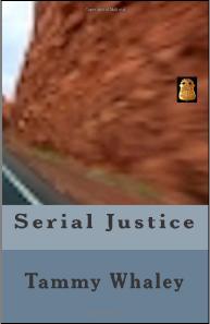
Small badge, out of focus image of clay. Says 'serial justice' to me. |
||||||||
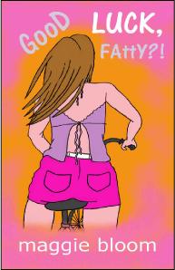
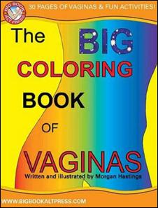
Good luck selling any. |
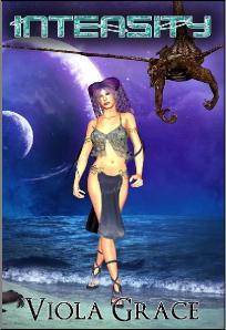
This cover hurts my face. |
|||||||
 |
 |
|||||||
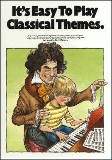
. . . and if I was Timmy, I 'd feign serious illness to avoid quality lap-time with pedo Beethoven. |
||||||||
I know what you're thinking; that typography is appalling. |
||||||||
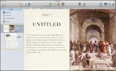
I remember the giddy days of desk-top-publishing and the heady feeling of power when a real magazine appeared on your flickering Mac Classic screen. With the release of Apple's new free app, iBook Author, it seems we are about to enter another era of appalling layouts and nauseating font usage. But once the dust has settled I'm sure we'll see a raft of beautifully produced independent iBooks. Apple have fixed the wee glitch in the End-User Licence Agreement which meant they owned you, your publication and your house. Had a quick look and it actually looks like anyone conversant with Keynote, Word and Indesign can produce a fully functional, interactive eBook. You can drag and drop photos, text files and videos and then publish on iBooks with Apple taking 30% of the proceeeds. |
||||
 |
||||
 |
 |
|||||||
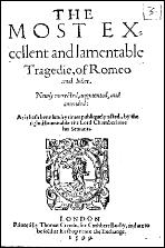
ROMEO & JULIET |
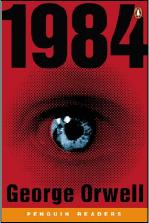
1984 |
|||||||
BAD BOOK COVERS OF THE WEEK |
||
 |
||||||||||
 |
 |
 |
 |
|||||||
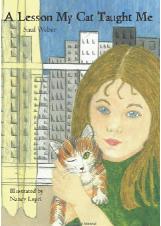
And the lesson is, don't use your friend's daughter to illustrate your cover. |
I'm not really a classic of English literature, honest. Pale imitation indeed. |
Some covers satirise themselves, but his hair really is awesome . . . |
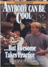
Personally I've never had any trouble in this area. |
|||||||
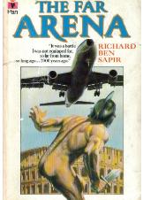
Naked gladiator, jumbo jet, swords . . . its got it all. |
||||||||||
COCKER-HOOP |
||
Jarvis Cocker, ex-frontman of britpop band Pulp, has been appointed a "broad commissioning role" for publishing house Faber & Faber. Expect him to connect with the common people, make some hardcore commissions and fellow workers being sorted for E's and Wizz. I'll stop now. Fabers are publishing Cocker's first collection of lyrics, Mother, Brother, Lover. Cocker will be specialising in music projects, as did previous Faber editor Pete Townshend. A little know fact is that Jarvis entered the road-accident/light entertainment programme Stars in their Eyes in 2002 and won with his spot-on turn as Rolf Harris. And which classic did he cover? What else but Two Little Boys. |
||||
 |
||||
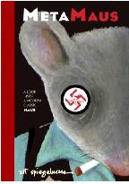
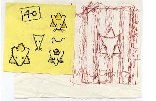
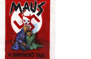
MAUS IS BACK |
||
I'll never forget the first time I read/looked at Art Spiegelman's Maus. The drawing that painstaking revealed how to repair a shoe well enough to survive Auschwitz was a touch of pure genius, a comic precursor to Life is Beautiful. Spiegelman recounts his father's story of life before, during and after the holocaust, with the Jews represented as mice and the Nazis as cats. It changed the way we approached the graphic novel, and was the only comic book to win a Pulitzer Prize. Art is back, with MetaMaus, a glorious deconstruction of the original work, the 'special features' of a DVD movie if you like, with a 300 page book, photos, pictures and a DVD with over 7,500 drawings. |
||||
 |
||||
 |
 |
|||
BOOK DESIGN AND LAYOUT by Nick Turzynski (This is a brief description of the design process for An Introduction to New Zealand Publishing, published by PANZ) Dissecting the process of design is a little like describing a painting or explaining a piece of music; in the act of making things clearer you simply make them more impenetrable. The good news is that a well-prepared publishing project can be handed over to the designer, a few weeks pass, and a beautifully designed book is born. Of course, it is not always this simple; there are certain pragmatic considerations that need to be addressed first, but if they are covered comprehensively, and with a small degree of vision and passion and not just a calculator, then you will arrive at that most elusive of beasts, a good brief. Typically, a publisher will approach a designer for preliminary designs. The publisher will provide a full brief, including practical details such as title, author, physical size, hardback or paperback, paper type, extent, project timeline and design budget. While these practical issues are often predetermined, the designer is sometimes involved in these decisions, because they are both financial and aesthetic ones. The designer can be particularly useful when discussing the cover. The addition of 'flaps' or special effects such as matt lamination or embossing can have powerful effects. Like most creatives, the designer will suggest a range of ideas that are wildly beyond budget. The designer is used to being disappointed, but every now and then one sneaks through and makes a huge impact. Briefing discussions are often accompanied by vigorous arm-waving and phrases like, 'It needs to be classic, yet modern,' but, a good designer can interpret most intentions. Having examples of the desired look — textures, colours, images — is helpful. The smallest thing could spark off a complete design concept. And, after all that hard work preparing the brief, it is important that the designer feels free to try an option that ignores the whole thing. Designers do not simply arrange graphic and typographic elements on a page, they are there to be creative, to have ideas. Samples Page design and typography Many authors have fixed ideas about the use of their material. Sometimes this is very helpful, sometimes not so much. A good designer will take their input into consideration, but also feel free to come up with other approaches. In my experience this usually results in a much happier author, who suddenly sees their familiar material in a new light. Authors with too much say on design matters are nearly as disastrous as designers with too much to say on editorial matters. For all books, typography is an elemental part of the design, and often the most overlooked. At the very least it involves choosing and using the right font in the right way to make the text legible. The relationship between point size and leading (so-called from the old hot metal printing days when strips of lead were used to set a fixed distance between lines of text) is critical to legibility. At its most complex a beautifully chosen and employed typeface can establish the entire identity of the book. Good typography is just as easy to spot as bad and should be as closely considered as all the other elements of design. Layout When first layout is complete, the designer will provide page proofs to go to the author and for proofreading. The designer will then take in any corrections and supply finished files, either as native InDesign files or print-ready PDFs. Good designers don't live in the rarified air of their cosy studio. They have an understanding of all the elements that make a successful book, including the commercial realities of publishing. It is their job to create the most appropriate and beautiful design for whatever book they are working on, where spacial sense, use of image and typography all come together in some alchemical process that produces 'good design'. The more efficiently something works, the less we think about how it came to be so. As designer Richard Hendel said, 'If printing is the black art, book design is the invisible one.' |
||
 |
||
Now I appreciate why we have professional book reviewers . . .
iBook author: its déjà vu . . . again
Timmy, its time for you lesson.
I'd snatch that off the shelf
A reminder of why you really shouldn't do your own cover when posting to amazon . . .